


Redesigning flight booking and check-in for a more streamlined experience.
Project type: End-to-end redesign of existing site features
Role: Sole UX/UI designer
Industry: Travel & Aviation
Tools: Figma and FigJam
Duration: Q2-3 2025
Note: This is an independent, non-affiliated redesign project.

Introduction
Opportunity for Improvement
Booking a flight can be stressful, with users often struggling to compare options, understand pricing, and navigate complex check-in processes. Hidden fees, unclear fare breakdowns, and multi-step flows can make even experienced travelers feel uncertain and frustrated. By improving pricing transparency and streamlining the booking and check-in experience, United Airlines has the opportunity to make air travel more efficient, predictable, and user-friendly, helping travelers confidently plan and manage their trips from start to finish.
Target Travelers
The redesign focuses on improving the experience for:
Frequent travelers who value speed, efficiency, and clarity in booking and check-in.
Occasional flyers who need a straightforward, transparent process without confusion or extra steps.
Both groups benefit from clear pricing, intuitive navigation, and accessible flight details, ensuring a smoother experience for all users.
Booking – Feature Overview
The redesigned booking flow simplifies trip planning by emphasizing clarity and ease of comparison:
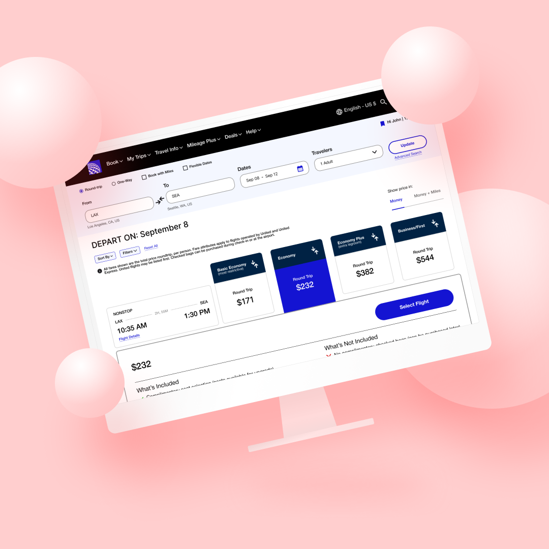
View pricing details upfront for full transparency
Compare flights effortlessly with a cleaner layout
Navigate the booking process in fewer steps for a faster experience

- 25 year old traveler“It’s frustrating when the final price ends up higher than what I first saw.”

“I shouldn’t have to open five tabs just to figure out what’s included in my flight.”
Check-In– Feature Overview
The updated check-in system reduces friction and saves time through a streamlined, intuitive flow:
Fewer screens and clearer prompts for quick completion
Smart reminders and progress indicators to guide users
Enables travelers to manage their trip confidently from start to finish
- 27 year old traveler
- 32 year old traveler“I already have so much to plan for my trip, booking shouldn’t be another headache.”
Research
Research Objectives
The goal of this research was to understand how users navigate flight booking and check-in, focusing on common frustrations and areas of friction. I aimed to uncover challenges with multi-step workflows, unclear fare information, and overall navigation, as well as users’ expectations for pricing transparency, fare comparison, and post-booking management. Insights were gathered through in-depth user interviews.
Research Focus & Anticipated Opportunities
-
Explore how users search, compare, and select flights to uncover friction points and streamline the overall booking experience.
-
Investigate how fare details, fees, and add-ons are perceived to design clearer, more trustworthy cost communication.
-
Examine how travelers complete check-in, access boarding passes, and prepare for travel to create a faster, easier experience.
-
Improved booking efficiency, transparent pricing, reduced friction during check-in, and an overall more intuitive and stress-free experience.


In-Depth Competitive Analysis using SWOT
To inform the redesign of United Airlines’ booking and check-in experience, I conducted an in-depth SWOT analysis of Delta, American, and Southwest Airlines. This research highlighted differences in:
Pricing transparency
Customer loyalty programs
Route coverage
Digital experiences
Delta and American focus on premium services and international reach, while Southwest excels in budget-friendly, simplified booking. Comparing their strengths, weaknesses, opportunities, and threats allowed me to identify gaps in user pain points around pricing clarity, booking efficiency, and seat selection, which directly influenced the design priorities for United.
Turning Insights into Opportunity
After conducting user interviews and analyzing the booking experience, several key pain points emerged: users struggled with unclear pricing, unnecessary navigation steps, and difficulty identifying what was mandatory vs. optional during booking. Many also expressed that the process felt overwhelming, especially when juggling travel logistics like packing or coordinating schedules.
To address these insights, I reframed the challenges into actionable design questions.
After conducting user interviews, we synthesized key findings to uncover recurring frustrations with United Airlines’ booking and check-in experience. A major pain point was the lack of pricing transparency; many participants noted that total costs, including baggage fees, seat upgrades, and add-ons, were not clearly shown until the final stages of booking. This left users feeling uncertain and forced them to leave the site to do side research or compare costs elsewhere.
Additionally, users expressed frustration with unclear ticket inclusions, often unsure of what was covered in their fare type or what additional costs they might face later. This lack of clarity contributed to decision fatigue and reduced trust in the platform. Overall, participants emphasized a strong need for upfront, transparent pricing and clearer breakdowns of what’s included in each fare to make booking decisions faster, more confident, and more seamless.


Interview Insights
Define
Improving the Booking & Checking-in Journey
User feedback played a central role in shaping each design decision, helping us align the flow with how travelers naturally search for, compare, and purchase flights. To establish a strong foundation, we created detailed user personas, mapped booking journeys, and outlined user flows, which guided both the structure and functionality of the redesign. These deliverables ensured that each step, from flight selection to checkout, was intuitive, efficient, and transparent, ultimately reducing friction and helping users feel more confident throughout the process.
User Personas
User Flows
Designing user flows was essential to streamlining the redesigned United Airlines experience and ensuring that key actions felt intuitive and efficient. The two primary flows I focused on were:
Booking a Flight – guiding users through a clearer, more transparent booking process that highlights pricing details, fare inclusions, and seat options upfront to reduce confusion and last-minute surprises.
2. Checking In for a Flight – simplifying the check-in process with fewer steps, clearer prompts, and an overall faster, more seamless experience.

Frequent Business Traveler
Books last-minute trips
Prioritizes speed, efficiency, and clarity
Values transparent pricing, easy seat selection, and quick check-in
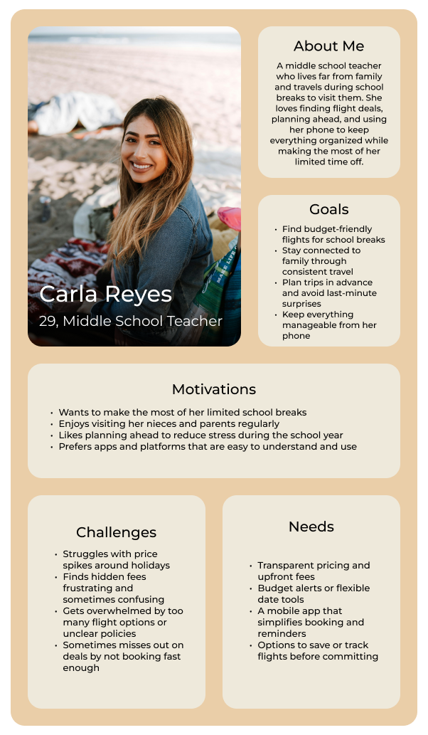
Repeat Family Visitor
Flies regularly to one main location, occasionally to new destinations
Values consistency, clear fare details, and simple rebooking
Wants tools to compare prices and manage repeat routes
Product Requirements
To guide the redesign, I prioritized features based on user needs, pain points, and research insights, ensuring the most critical issues were addressed first. List are the primary features I wanted to address:
High Priority – Core features solving major frustrations:
Simplified Booking Flow: Streamlines steps to reduce cognitive load and speed up booking.
Save & Organize Previous Bookings: Lets frequent travelers quickly view and rebook flights.
Upfront & Baggage Cost Visibility: Increases transparency and builds trust by showing full pricing early.
Medium Priority – Potential enhancements for convenience and personalization:
Customized Notification Preferences: Allows users to control alerts for flights and updates.
Low Priority – Future iterations for expanded functionality:
Multi-Language Support: Improves accessibility for international users.

Design
Design Integration with United Airlines’ Brand
Since this redesign built on an existing platform, much of the process focused on aligning with United Airlines’ established branding, colors, logo, and visual style, while addressing key pain points. The exact website typography was unclear, so I used Helvetica Neue to maintain a clean, professional, and approachable feel. Button styles, spacing, and icons were carefully chosen to ensure the redesign felt seamless, while improving clarity, transparency, and efficiency in booking and check-in.
Wireframes
During the redesign of United Airlines’ booking and check-in system, I created desktop and mobile wireframes to ensure a responsive, consistent experience across platforms. Early iterations focused on layout, core tasks, and user clarity, including flight search, fare comparison, and check-in. Later iterations refined spacing, hierarchy, and essential elements like fare details, seat selection, and confirmation prompts. High-fidelity designs applied United’s brand colors and Helvetica Neue typography, creating a professional, intuitive interface that addressed key pain points and guided users smoothly through booking and check-in.
Lo-Fi Wireframes
Desktop - Booking a Flight


Desktop - Checking In


Mid-Fi Wireframes


Hi-Fi Wireframes


In my initial redesign, I explored a layout that required users to navigate across multiple screens to compare flights and view fare details. While functional, it felt disconnected from the desktop experience and introduced unnecessary steps. In the refined version, I consolidated these interactions into a single, more cohesive flow, allowing users to access all key information within one view through expandable dropdowns.
Initial Redesign Concept (Scrapped Version) for Mobile - Booking
Refined Mid-Fidelity Designs (Final Direction) for Mobile - Booking
Test
Usability Testing & Prototyping
Prototype for Desktop (Tasks #1-2)
I conducted task-based usability testing focused on the two primary user flows: booking a flight and checking in online. Participants were asked to complete these tasks using a desktop prototype, reflecting the most common device travelers use for flight management. Throughout the sessions, users were encouraged to think aloud, sharing their thoughts as they navigated pricing details, selected seats, and completed check-in steps. I primarily observed as a facilitator, stepping in only when participants encountered significant confusion. This approach provided valuable insights into how users interpret pricing transparency, understand fare options, and move through the booking process, helping shape a more intuitive and frustration-free experience.
I conducted usability testing using a high-fidelity desktop prototype, reflecting the primary platform travelers use for booking and check-in. Participants were asked to complete key tasks such as searching flights and checking in. Observations focused on identifying which interactions felt intuitive and where friction occurred. Testing revealed areas for improvement in pricing clarity, seat selection, and multi-step check-in forms.
Key Performance Benchmarks for Task Completion
-
Target Completion Time: Under 2 minutes
Error Allowance: 0–2 errors
User Confidence: 7 or above (on a 1–10 scale)
-
Target Completion Time: Under 1 minute
Error Allowance: 0–1 error
User Confidence: 9 or above (on a 1–10 scale)
Testing Methods and Execution
Measuring Usability & Success Metrics
The usability testing results showed that the redesigned booking and check-in experience was intuitive and easy to use. For the booking flow, most participants rated the experience between 9 and 10, with an occasional 8 due to its longer, more detailed process. The check-in flow, being simpler and more straightforward, consistently received 9–10 ratings across all participants. All participants also completed the tasks within the targeted timeframe.
Users highlighted that having clear pricing information displayed upfront made the process feel more transparent and significantly reduced the need to research details on the side, ultimately speeding up their booking experience compared to the current system. One key piece of feedback was that certain steps could be more clearly labeled as mandatory or optional, which was addressed in subsequent iterations to enhance clarity and reduce potential confusion.
Iterations
Only minor changes were needed after usability testing, as participants were able to navigate the redesigned booking and check-in flows with ease. The main adjustments focused on improving clarity and streamlining the experience; for example, making certain steps and form fields appear more clearly mandatory to reduce confusion, tightening the flow to feel more succinct, and refining small visual elements to address design oversights. These subtle yet impactful tweaks helped create a more polished final prototype that feels intuitive, efficient, and user-friendly.
Conclusion
This project challenged me to balance brand constraints with user needs, prioritizing pricing transparency, clear fare breakdowns, and a more efficient booking and check-in flow. Working within United’s established ecosystem required strategic design decisions to maintain brand consistency while reducing friction and uncertainty for travelers.
A key challenge was bridging desktop and mobile experiences while keeping the design consistent and intuitive. Since most users book on desktop but check in on mobile, I had to ensure both flows felt cohesive without duplicating unnecessary steps. Balancing these differences required careful layout adjustments and interaction refinements, making sure information stayed accessible and clear on each platform.

Through this redesign, I learned the importance of designing within existing brand systems while still finding opportunities for innovation. It deepened my understanding of how clarity and feedback directly shape user confidence, and how small interaction-level improvements can create meaningful change.
Looking ahead, I’d like to explore enhanced accessibility features and a more succinct seat selection process, since most airline platforms still rely on scroll-heavy maps. Incorporating condensed list views or smart seat suggestions could greatly improve efficiency. This project ultimately taught me how thoughtful, research-driven adjustments, no matter how small, can make a large-scale system feel more transparent, trustworthy, and user-centered.