a playlist feature for organizing and sharing Netflix content
Easily create, organize, and share Netflix playlists for a more personalized experience.
Project type: End-to-end app feature integration for an existing platform
Role: Sole UX/UI designer
Industry: Streaming & Entertainment
Tools: Figma and FigJam
Duration: Q1 2025
Note: This is an independent, non-affiliated redesign project.
Introduction
Potential Feature Benefits
-
Users can create, share, and collaborate on playlists, making the experience more interactive and engaging.
-
Playlists allow users to easily organize their favorite shows and movies, helping them discover content tailored to their preferences.
-
Sharing playlists within households or with other Netflix users fosters stronger social connections and enhances the communal viewing experience.

The Opportunity
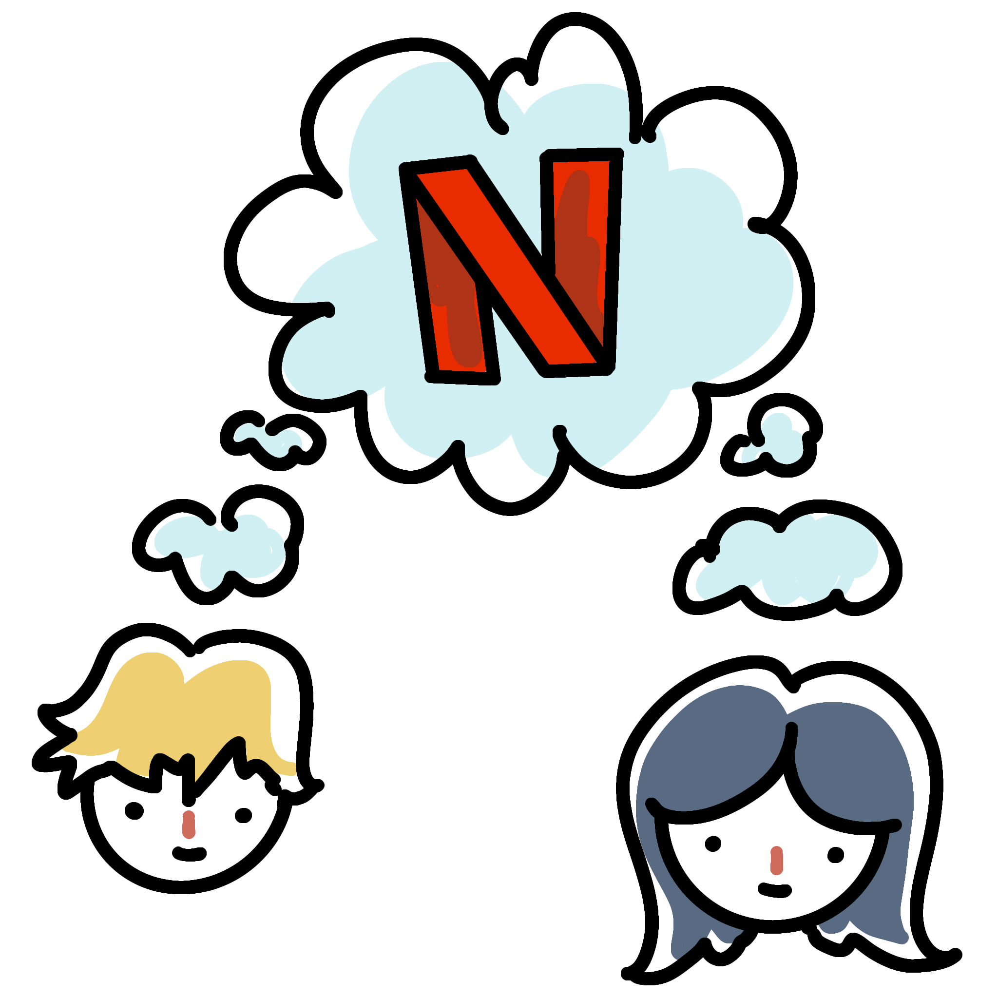
Netflix, with over 260 million subscribers, has long been a social experience, connecting people through shared recommendations, watch parties, and discussions. Whether through word of mouth, social media, or in-person conversations, Netflix plays a key role in how people connect over entertainment. However, while users already engage socially, the platform lacks built-in tools for seamless content sharing and organization. Enhancing these interactions can make Netflix even more personal and connected.
Target Audience
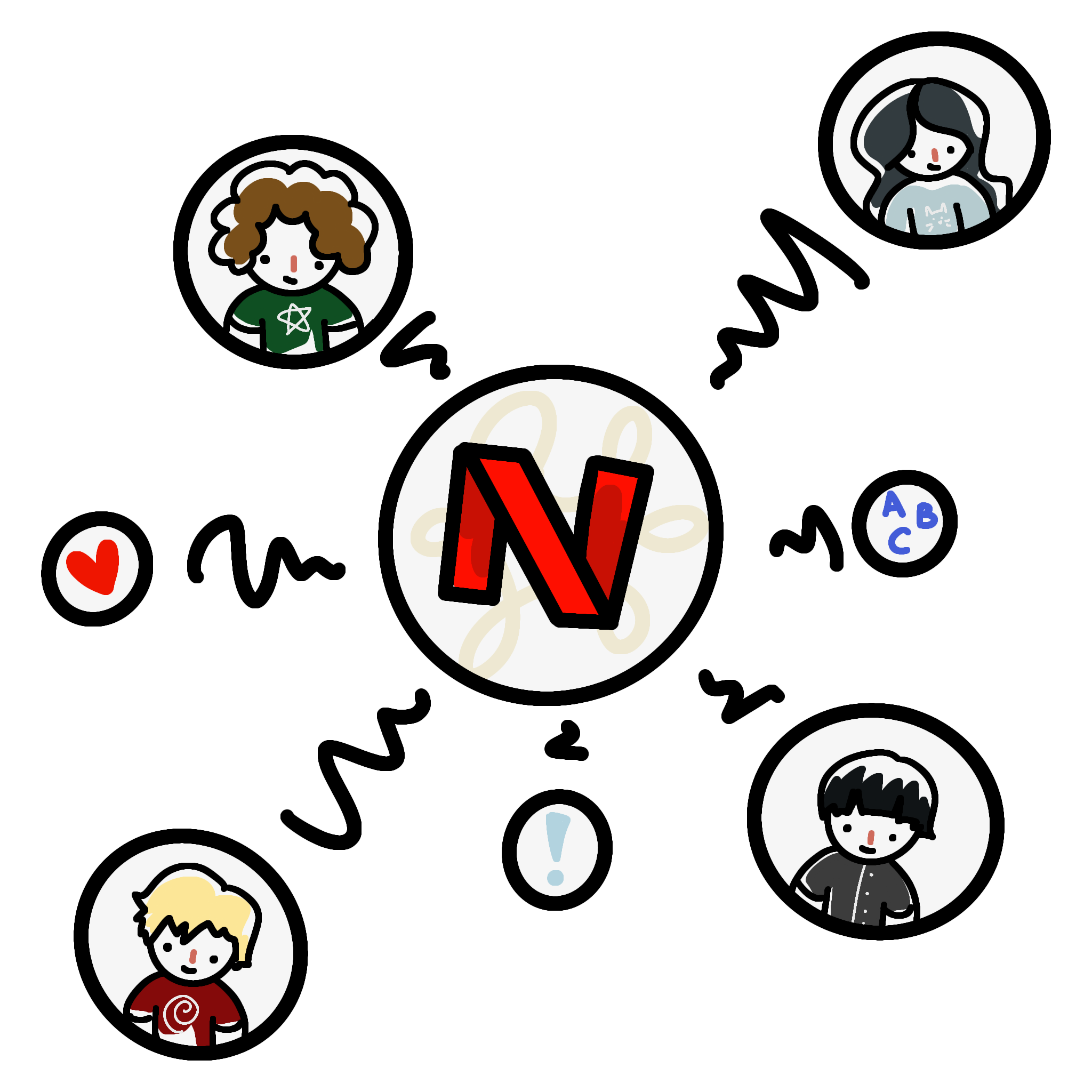
Upon exploring how users engage with streaming platforms, I identified Gen Z and Millennials as the primary target demographic for this feature. As moderately tech-savvy users, they are accustomed to personalization, content curation, and social sharing in digital experiences. Younger audiences are accustomed to platforms that offer personalized experiences and enable easy sharing of content with others. However, while this feature is designed with these users in mind, content organization and sharing are universally beneficial, making it a valuable addition for users of all demographics.
Features include:
Create playlists: Curate favorite shows and movies into themed collections
Share with others: Collaborate within a Netflix household or with other users
Add together: Shared playlists allow others to contribute content
Enhance connection: Encourages social interaction through shared viewing experiences
Research
Research Objectives
The goal of this research is to understand user habits when utilizing Netflix and other streaming services, focusing on both social and organizational behaviors. I aimed to learn how users share, recommend, and organize content, as well as their preferences for personalized features. I also explored what users like and dislike about streaming services, with a particular emphasis on Netflix, to identify areas for improvement and innovation. I conducted my research through in-person user interviews.
Notable Focus Points
-
Investigating how users utilize the current 'List' feature to collect and organize saved content, as it's the primary method for users to track shows or movies for later viewing.
-
Exploring how users share content with others, including whether they prefer collaborative viewing or discussing shows with friends, and how sharing impacts their experience.
-
Understanding users’ habits around rewatching specific episodes or entire shows/movies, and how they keep track of what they've seen or want to rewatch, to improve content organization.
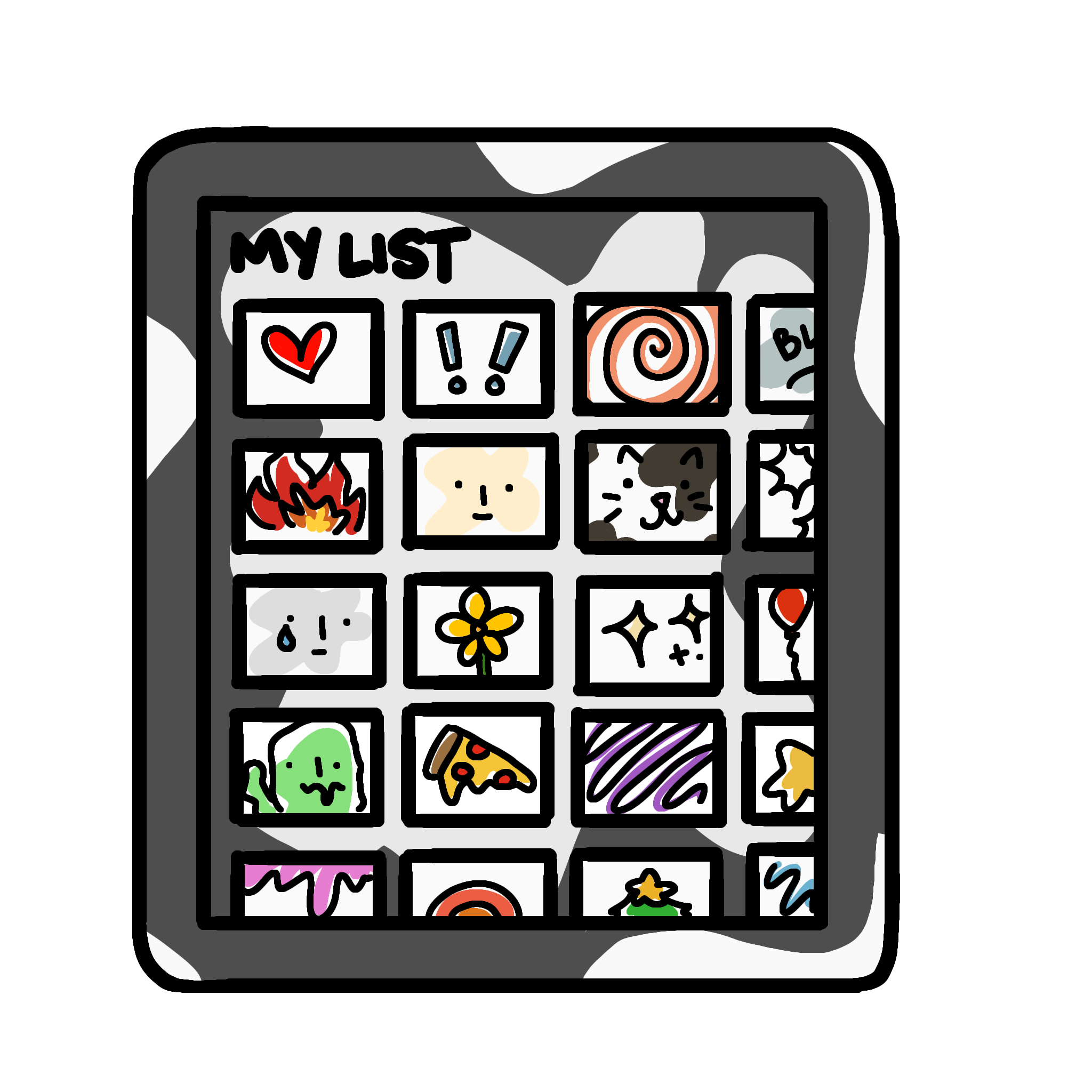
After conducting user interviews, we categorized key findings to identify common frustrations. Many participants expressed dissatisfaction with Netflix’s current My List feature, noting its lack of organization and personalization. Users found it difficult to navigate since all saved content is grouped into one massive list, making it cluttered—especially for those sharing a profile. Additionally, participants highlighted how watching and sharing content with friends and family is an important social experience, often relying on external messaging to exchange recommendations. Most users admitted they rarely use My List, as searching for a title or relying on Continue Watching is often more efficient. Overall, users desired more customization options, allowing them to organize content based on moods, occasions, or personal preferences.
Analyzing Interview Transcripts


In-Depth Competitive Analysis using SWOT
To inform the design of the collaborative playlist feature for Netflix, I conducted an in-depth competitive analysis of major streaming platforms, Disney+, Hulu, and Max, using a SWOT framework. This analysis uncovered valuable insights into how competitors approach social interaction, personalization, and content discovery.
Key Findings:
Strengths: Strong brand loyalty and exclusive content drive user retention.
Weaknesses: Limited social sharing and collaboration tools across platforms.
Opportunities: Space for playlist customization and intuitive content organization.
Threats: High competition and platform fatigue among users.
Disney+

Research Synthesis: Reimagining How Users Connect Through Content


User interviews revealed that while Netflix is already a social experience, its current tools don’t support meaningful content sharing or organization. Many users rely on external apps or messages to recommend shows, and the “My List” feature felt cluttered and impersonal.
These insights led to a few guiding “How Might We” questions:


Hulu

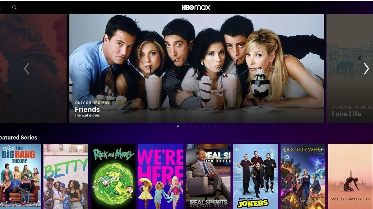
HBO Max
Define
Establishing Structure and Defining the Experience
Throughout the design process, we took an iterative approach, refining the playlist feature based on ongoing user feedback. This ensured that every decision aligned with how users naturally interact with streaming platforms. To build a strong foundation, we developed user personas, user flows, and task flows, which guided the structure of the feature. These deliverables allowed us to make thoughtful adjustments and create a more intuitive and seamless experience.
User Personas


Gen Z (ages ~16–25)
Value social connectivity and content sharing across platforms.
Enjoy collaborative, interactive experiences that feel community-driven.
Expect personalized recommendations and ease of use across devices.

Millennials (ages ~26–40)
Frequently share content with friends and family through various channels.
Appreciate organized, customizable tools for managing what to watch next.
Seek a streamlined, social way to discover/share entertainment.
User Flows
Designing user flows was crucial in refining this Netflix feature, ensuring that key tasks were both intuitive and efficient. The two initial flows I created were:
1) Creating and pinning a playlist to the homepage
2) Creating and sharing a collaborative playlist
However, after gathering feedback and iterating, I ultimately scrapped the pinning feature, as I realized the feature could be directly built into the homepage, eliminating unnecessary steps and streamlining navigation. The primary user flow I decided to focus on is creating and sharing a collaborative playlist, as it enhances the social and organizational aspects of the streaming experience.
Task Flows
Defining task flows was essential in breaking down the step-by-step interactions users take to complete specific actions within the feature. The two primary task flows I focused on were
1) Creating a playlist and adding content
2) Sharing a playlist with an external Netflix user
By mapping out these flows, I was able to identify friction points, optimize steps, and ensure that users could seamlessly create, manage, and share their playlists without unnecessary complexity.

Design
Integrating with Netflix’s Existing Design
Since this feature was added to an existing platform, the design process focused on creating wireframes that seamlessly integrated with Netflix’s interface. Rather than altering the platform’s structure, the goal was to enhance content organization and social sharing while maintaining a familiar user experience. Icons and UI elements were designed to mirror existing Netflix features, ensuring consistency and minimizing the learning curve for users.
Wireframes
Throughout the design process, I iterated through low, mid and hi-fidelity wireframes to refine structure, flow, and usability. Since most users stream on TVs, I prioritized the TV experience, while also designing mobile screens for QR code integration, enabling seamless playlist creation across devices. Each iteration focused on improving clarity, functionality, and consistency.
Lo-Fi Wireframes


Mid-Fi Wireframes


Hi-Fi Wireframes


Test
Usability Testing & Prototyping

Prototype for TVs (Tasks #1-3)
I conducted task-based usability testing, asking participants to complete the primary user flows on a TV interface. Participants were encouraged to think aloud while navigating the feature, with me observing as a spectator and stepping in as a facilitator only if they encountered significant difficulties.
To ensure this feature provided a seamless user experience, I conducted usability testing using a high-fidelity prototype on Netflix’s primary device—TV. By observing participants as they navigated the interface, I identified which interactions felt intuitive and which needed refinement. Additionally, I tested the QR code functionality on mobile devices, ensuring a smooth experience for users adding content to playlists from their phones. These tests helped refine the design and improve usability across different devices.
Prototype for Mobile (Task #4)
Key Performance Benchmarks for Task Completion
-
Target Completion Time: Under 30 seconds
Error Allowance: Fewer than 1 error
User Confidence: Measured on a numerical (1-10) or bipolar scale
-
Target Completion Time: Under 30 seconds
Error Allowance: Fewer than 2 errors
User Confidence: Measured on a numerical (1-10) or bipolar scale
-
Target Completion Time: Under 20 seconds
Error Allowance: Fewer than 1 error
User Confidence: Measured on a numerical (1-10) or bipolar scale
-
Target Completion Time: Under 1 minute
Error Allowance: Fewer than 3 errors
User Confidence: Measured on a numerical (1-10) or bipolar scale
Testing Methods and Execution
Measuring Usability & Success Metrics
The usability test results demonstrated that the playlist feature was highly intuitive and easy to use. Based on usability scores, all users rated the experience between a 9 and 10 for ease of use, with 10 being the easiest. No participants encountered any errors, and each user completed their assigned tasks well under the target time constraints.
While there were no major pain points, a participant noted that button interactions lacked clear feedback, which can be addressed in future iterations. Additionally, another participant mentioned prototype speed limitations, which can be resolved in the final implementation. Some users also provided suggestions for future updates, such as increased personalization options, which can be considered for potential enhancements.
Iterations
Very few changes were needed after usability testing, as participants navigated the feature with ease. The primary adjustments included modifying the button colors after selection to provide clearer feedback and increasing the prototype speed between two key screens to minimize confusion. After implementing these refinements, the final prototype was established, ensuring a smoother and more intuitive user experience!
Conclusion
This project allowed me to refine my ability to design within an existing platform while prioritizing user needs. Through iterative testing, I learned that even small refinements, such as adding visual feedback on button presses, can greatly enhance usability. User research not only helped identify pain points but also revealed opportunities for future improvements, such as adding custom thumbnails, saving frequent collaborators as contacts, and exploring a more accessible mode for older users and those with visual impairments. Moving forward, I aim to further personalize the experience while ensuring the feature remains intuitive and inclusive for all users.